How to Add Multiple Trendlines in Excel
Introduction to the Dataset
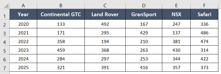
I’ll be using a table from company XYZ in the present instance. From 2020 to 2025, company XYZ sold varying numbers of these five automobile types.
Process to Add Multiple Trendlines in Excel
Usage Guide
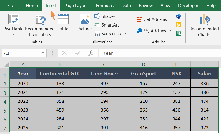
Step_1: First click on any cell from the data table and press CTRL+A.
This will select the entire data table.
Step_2: Next, go to the Insert tab.
Step_3: Now select a Scatter Plot from the Scatter drop-down menu under the Charts group.
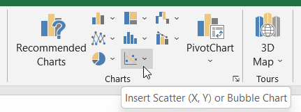
Note: Otherwise, you can choose a chart style from the Recommended Charts.
Your preferred chart will pop up on the worksheet beside the data table.
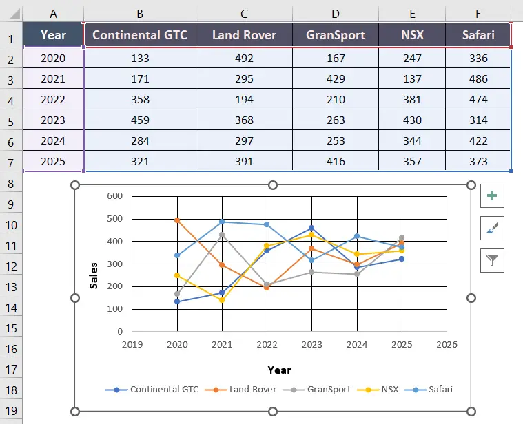
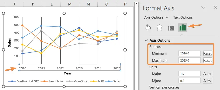
Notice, that the data points range from the years 2020 to 2025. However, the horizontal boundaries were in place from 2019 to 2026. The horizontal boundaries are normally expanded in Excel when generating a chart. You will have to trim the boundaries in this case.
To do that,
Step_4: double click on the horizontal values.
This will open the Format Axis task pane.
Step_5: Go to the Axis Options.
Step_6: Insert 2020 as Minimum Bound and 2025 as Maximum Bound.
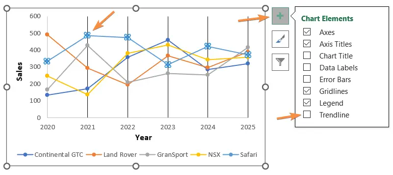
Step_7: Now click on any of the trendlines.
I selected the trendline of Safari.
Step_8: Go to the Chart Elements.
Step_9: Put a tick mark in the Trendline box.
The trendline from Safari will appear on the chart immediately.
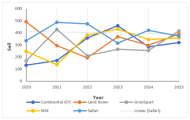
Repeat the steps from Step_7 to Step_9 to add multiple trendlines to the graph.
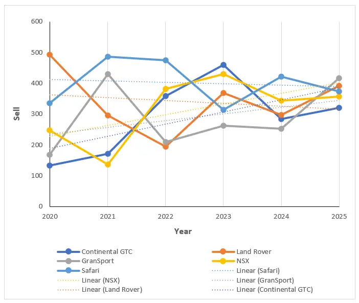
Final Result >
I have added all the trendlines for each data series. You can take a look at the following image:
Customize the Trendline Appearance
To professionalize the appearance of the chart, you can customize the trendlines.
Step_1 Right-click on the trendline.
Step_2: Go to the Outline.
Step_3: Open the Dashes drop-down menu.
Step_4: Select a wider dash style.
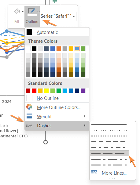
Your chart will appear more attractive this way.
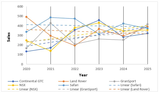
You can also explore other customization options.
Conclusion
I hope you got a complete idea of adding multiple trendlines in Excel sheets. Drop your comment about this article in the comment box. Also, keep visiting our website for learning more about Microsoft Excel and its different features. Thank you!