Data Visualization with Pivot Chart in Excel
What is a Pivot Chart?
A pivot chart is a special type of chart in Excel that helps you understand and analyze large amounts of data. It works hand in hand with a pivot table, which is where the data is organized. With a pivot chart, you can easily change how the data is shown by adjusting filters, rearranging the layout, or digging into specific details. It allows you to interact with the data, making it easier to uncover insights and patterns.
Introduction to the Dataset
To begin the procedure on how to create a pivot chart in Excel, let me introduce you to the dataset that I am using for this article to create the pivot chart.
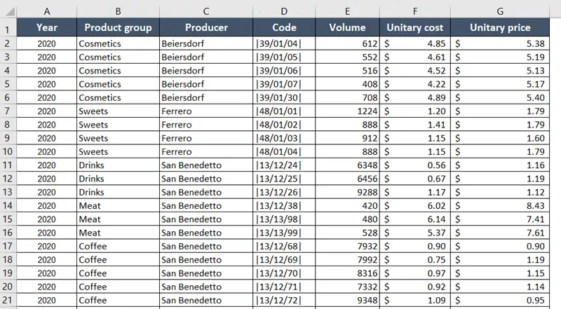
It is a list of product details ordered by a superstore. The dataset has a record of the past years and has more than 15,000 entries in this worksheet. As it is difficult to manage and see the record of this large volume of data by scrolling the Excel sheet, I am going to use a pivot chart instead.
How to Create a Pivot Chart in Excel?
You can create a pivot chart using these techniques directly from a data source or from an existing pivot table, depending on the specific requirements you have.
1. Pivot Chart from Data Source
Usage Guide
Step_1: Select a cell from the dataset and press CTRL+A.
This will select the data range.
Step_2: Select the Insert tab from the ribbon.
Step_3: Click on the PivotChart button from the Charts group.
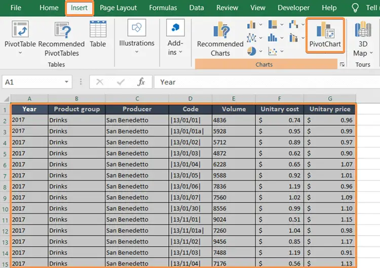
The Create PivotChart dialog box will appear on the screen.
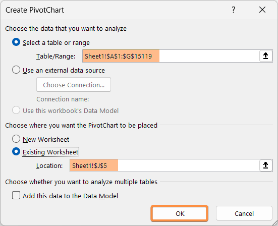
Step_4: Insert a cell range in the Table/Range box.
As I already selected the data range in Step_1, I don’t need to input a cell range.
Step_5: Select an option from the Choose where you want the PivotChart to be placed section.
I selected the Existing worksheet.
Step_5: Click on an empty cell of the worksheet, cell J5.
Step_6: Skip the check box Add this data to the Data Model.
Step_7: Finally, hit the OK button.
Final Result
This will generate an unfilled pivot chart and its associated pivot table.
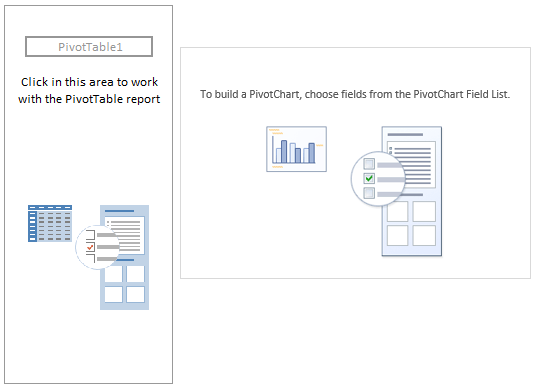
To create a report and chart, you can add the necessary fields.
2. Pivot Chart from Pivot Table
Here, I have already created a pivot table from the dataset.
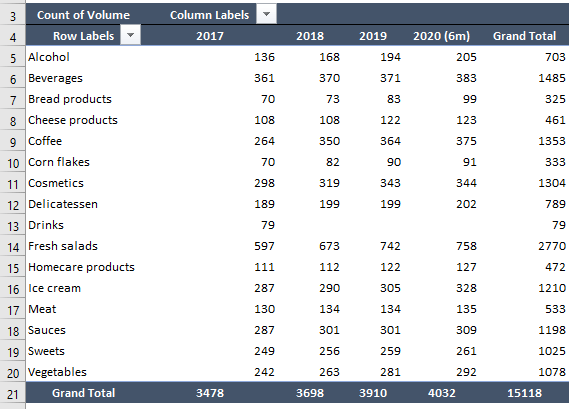
Usage Guide
Step_1: Click anywhere within the pivot table.
This will make visible the PivotTable Analyze tab in the Excel ribbon.
Step_2: Now go to the PivotTable Analyze > Tools > PivotChart.

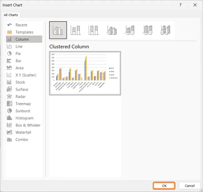
The Insert Chart dialog box will come up.
Step_3: Choose the preferred chart type from the available options.
Step_4: Click on the OK button.
Final Result
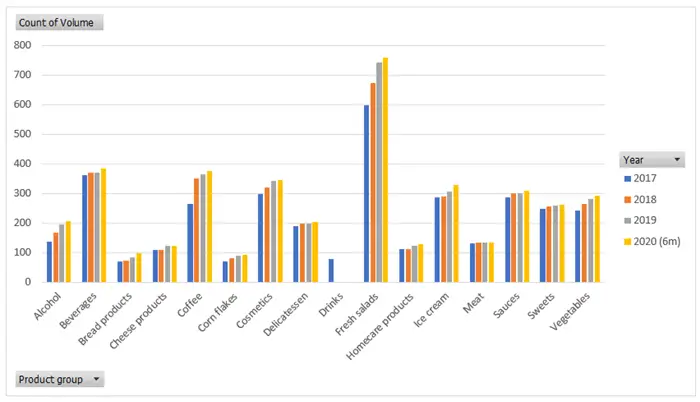
I picked a Clustered Column Chart like the one above.
Changing the Chart Type
Excel has a range of chart varieties for efficient data representation. Follow the below steps for changing a pivot chart’s chart type in Excel.
Usage Guide
Step_1: Click on the pivot chart to select it.
Step_2: Navigate to the Design tab from the ribbon.
Step_3: Click on the Change Chart Type button.

The Change Chart Type dialog box will show up on the worksheet.
Step_4: Choose a new chart type from the available options.
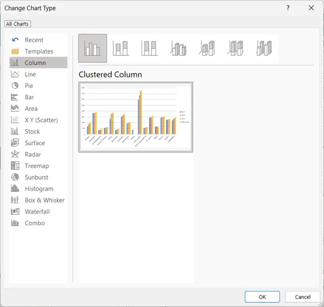
Step_5: Click OK to apply the new chart type.
Features of Pivot Chart in Excel
When you work with pivot charts in Excel, it is crucial to understand the features and functionalities of pivot chart fields. The pivot chart has a PivotChart Fields task pane for organizing and displaying the chart.
A. Pivot Chart Fields
The pivot chart and pivot table are interactive. When you make any change in the pivot table, the pivot chart instantly updates. This is why using the pivot chart is so convenient and popular. The main tools of the pivot chart are displayed in the pivot chart fields pane.
1. Field List of Pivot Chart
The columns of your source dataset are the inputs of the field list. The field list looks like this:
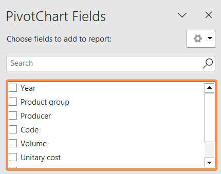
As you select the check boxes from the list, the field will be added to the pivot chart.
2. Area List of Pivot Chart
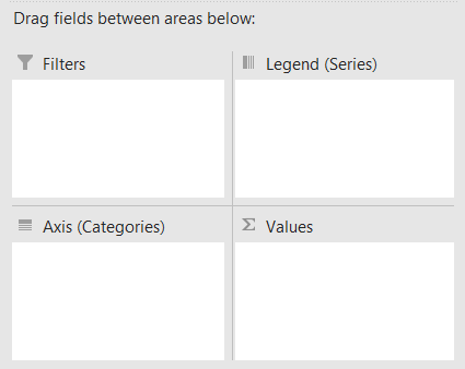
The area list has four areas:
- Filters
- Legend (Series)
- Axis (Categories)
- Values
B. Filters Area
By adding fields to the Filters area, you can set conditions to include or exclude specific data points based on certain criteria.
Drag the field name from the Field List to the Filters area to insert it in the pivot chart.
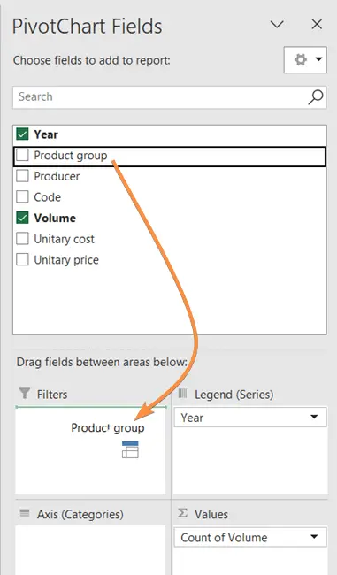
As you add the fields in the Filter area, the filtering option will appear in the top-left corner of the pivot chart.
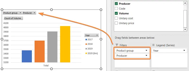
You can use the filtering drop-down menu from the pivot chart to filter out your preferred data.
C. Legend (Series) Area
The Legend (Series) area in the pivot chart specifies the name of each series. The legends help to easily specify the columns with different colors.
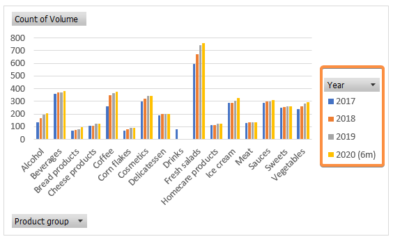
You can remove unnecessary legends from the pivot chart. Simply click on the drop-down menu and edit the Legend area.
D. Axis Area
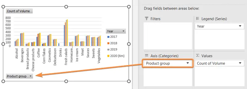
The Axis area, also known as the Categories area, allows you to set the horizontal (X) axis labels.
As you input a field in the Axis area, you will see the names appear on the horizontal axis of the pivot chart of the Excel sheet.
You can find the Axis area option in the bottom-left corner of the pivot chart. Modify the Axis area with that option.
E. Values Area
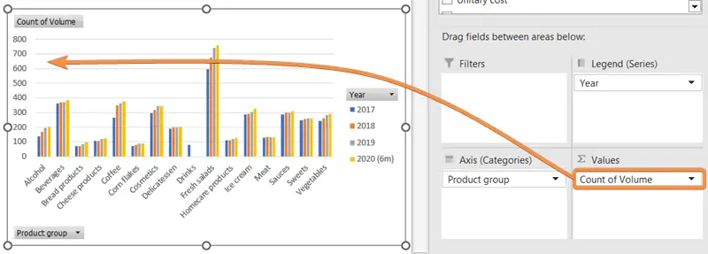
The Values area is where you place the fields that contain the numerical or quantitative data that you want to visualize in the pivot chart of Excel. By adding fields to the Values area, you define how the data is summarized and presented in the chart.
Here I wanted to display the volume of the products from the selected data source. The volume is represented this way in the pivot chart:
Remove and Reappear Pivot Chart Fields
The pivot chart fields task pane covers a sizeable space on the right side of the worksheet.
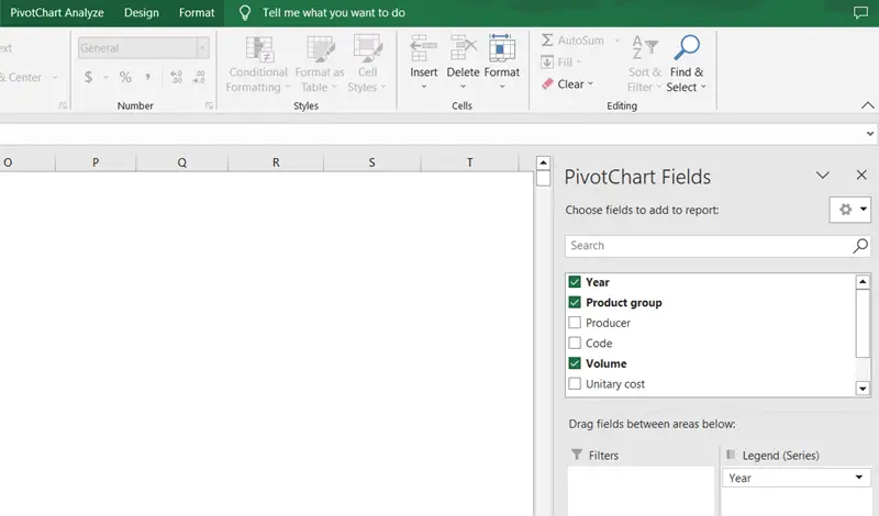
Sometimes having the pivot chart field in the sheet creates discomfort, so you should temporarily remove it.
To remove the pivot chart field, click on the cross (x) button in the top-right corner of the pivot fields task pane.
To reopen the pivot chart field, select the pivot chart to display the PivotChart Analyze tab. Then click on the Field List command.

Refresh Pivot Chart
Whenever you make any changes in the settings, refresh the pivot chart to ensure that the chart accurately reflects any changes or updates in the underlying data.
To refresh the pivot chart, go to the PivotChart Analyze tab and click on the Refresh command.

Insert Slicer in Pivot Chart
Slicers act as a visual filter for your pivot chart. By selecting a specific slicer, you can filter the chart to display only the data related to that item.
Insert a slicer by following the PivotChart Analyze tab > Filter group > Insert Slicer.

The Insert Slicers dialog box will come along on the sheet.
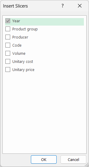
I have chosen the slicer Year. You can select a slicer from the Year menu like this:
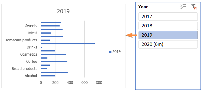
A slicer makes it easier to focus on particular subsets of data without changing the underlying pivot table in Excel.
Conclusion
Whether you need to track sales trends, compare performance across different categories, or explore patterns in your data, Pivot Charts provides a dynamic and interactive solution. Mastering this feature allows you to transform raw data into compelling visual narratives, enabling better decision-making and understanding of your data-driven endeavors.
Excel Glossary | Excel Charts | Pie Chart | Bar Chart | Line Chart | Column Chart