How to Create a Chart in Excel
Creating a Chart in Excel
Creating a chart in Excel is a simple process that can be done in just a few steps.
Usage Guide
Step_1: Select the data you want to include in the chart.
Step_2: Click on the Insert tab from the ribbon.
All the charts are available in the Charts group.
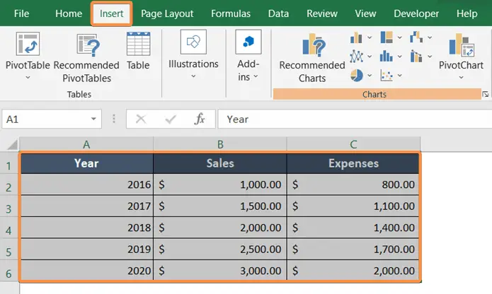
Step_3: Choose the type of chart you want to create from the Charts section.
I want to create a line chart. There are different styles of charts in the line chart menu.
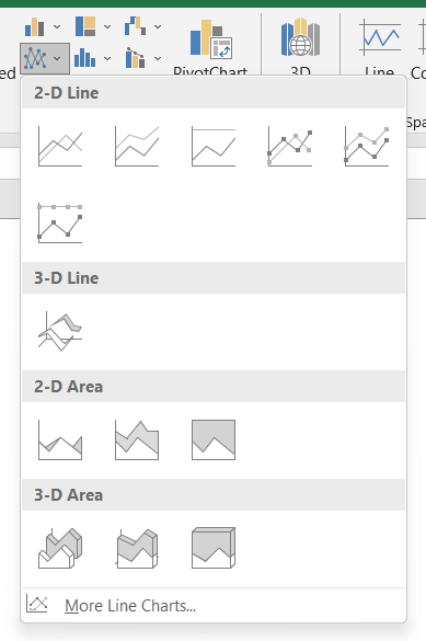
Step_4: Take the cursor to different options from the line chart menu.
It will display the final look of the chart on the sheet.
Step_5: Pick a suitable chart.
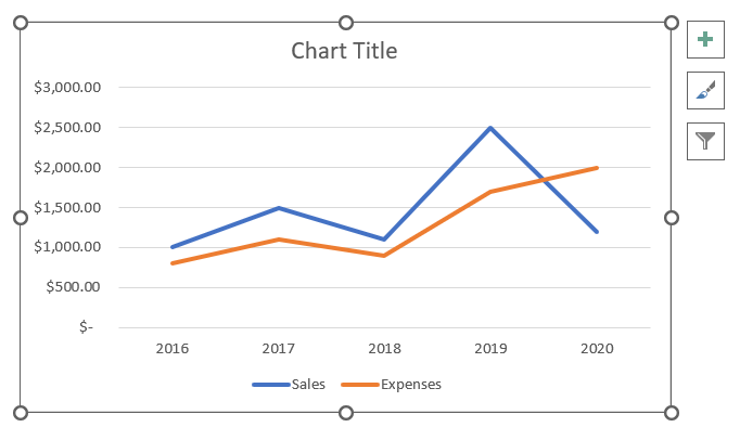
You can then customize the chart by selecting different chart styles and adding or removing elements like titles, labels, and legends.
Features of Charts in Excel
1. Switch Row/Column
If you want to alternate the data position from horizontal to vertical, you can use the Switch Row/Column command.
Usage Guide
Step_1: Double-click on the chart on the sheet.
Step_2: Then go to the Chart Design tab.
Step_3: Now click on the Switch Row/Column icon from the Data group.

2. Add Title on the Chart
To add a title, double-click on the chart title and write down the new title.
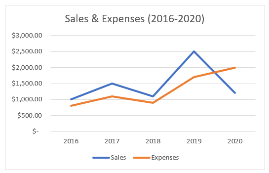
3. Add Axis Titles
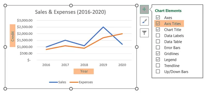
A graph or chart is incomplete without horizontal and vertical axis titles. To add axis titles, follow the steps below.
Usage Guide
Step_1: Select the chart.
Step_2: Click on the Chart Elements (+) icon.
Step_3: Select Axis Titles.
Step_4: Type the new axis names in horizontal and vertical positions.
4. Add Data Table
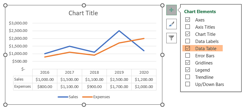
To add a Data Table follow the steps below.
Usage Guide
Step_1: Click on the Chart Elements (+) icon on the right side of the chart.
Step_2: Click Data Table.
Step_3: From the Data Table submenu, select No Legend Keys.
5. Change the Style and Color of Charts in Excel
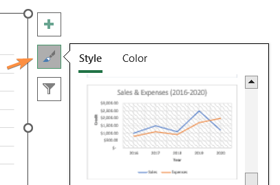
You can redecorate the chart using the Style and Color options. Different themes are available in the Style section.
6. Filter the Chart Series and Categories
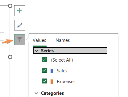
If you wish to focus on specific parts of the report, you can filter any part of the chart. Use the Filter option on the chart’s right side for that.
Conclusion
I hope you find this article helpful in creating charts in Excel. The features on the chart are very effective in building a creative chart or graph. Thank you for visiting our website!
Excel Glossary | Pie Chart | Bar Chart | Line Chart | Column Chart | Pivot Chart